Best Practices For Dashboard Interface Design
Mastering the art of data clarity in a world of information overload.
Introduction
Data is the new oil, but raw oil requires a refinery to be useful. In the realm of Business Intelligence, your user interface (UI) is that refinery. A great dataset holds no value if the user interface is cryptic, cluttered, or unintuitive. At StellarDash Analytics, we believe that design isn't just how it looks, but how it works for the decision-maker.
The 5-Second Rule
Information architecture is paramount. A user should be able to identify their three most critical KPIs within five seconds of landing on the page. We achieve this by prioritizing high-level metrics at the very top, using a clear visual hierarchy that guides the eye from the big picture to the granular details.

Color Psychology in Data
Color should be used for communication, not decoration. Using "traffic light" colors (Red, Yellow, Green) is intuitive, but they must be used responsibly. Overusing red can create unnecessary panic, while ignoring accessibility (like color blindness) can render a dashboard useless for 8% of your males users. We recommend a palette that uses muted tones for stable data and vibrant accents only for items requiring immediate action.
The Common Mistake
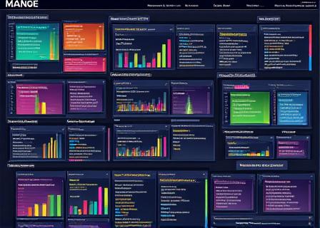
Cluttered 'Rainbow Dashboards' that use 10+ colors without meaning, leading to cognitive fatigue.
The StellarDash Way
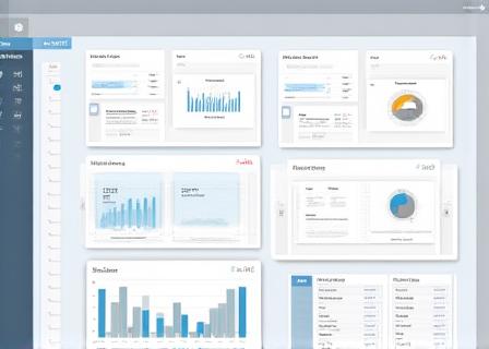
High-contrast, accessible palettes that use color only to highlight significant trends or anomalies.
Choosing the Right Chart
Complexity is the enemy of clarity. Follow these simple guidelines:
- Bar Charts: Best for comparing quantities across categories.
- Line Graphs: Exceptional for showing trends over time.
- Pie Charts: Use sparingly, only for parts-of-a-whole when you have fewer than 5 categories.
Conclusion
UI bloat happens when teams try to show everything at once. StellarDash’s customizable layouts and "drill-down" capabilities solve this by keeping the initial view clean while allowing power users to dive deep into predictive analytics with a single click. Ready to see the difference design makes?